Fintech

B2C

Experimentation

Como aumentamos a taxa de indicação da Nomad com táticas de Product Growth

Como aumentamos a taxa de indicação da Nomad com táticas de Product Growth

Como aumentamos a taxa de indicação da Nomad com táticas de Product Growth

Nomad Global

MY ROLE

Product Designer

TIMELINE

8 months (2023 -> 2024)

TEAM COMPOSITION

1 Product Designer, 1 Product Manager, Development squad

ABOUT

Nomad is a Fintech that offers an international account for Brazilians who wants to travel, invest and receive in dollars.

From 2022 to 2024, I worked in the Acquisition team, leading the end-to-end design strategy of the Member Get Member, bringing the referral program from 0 -> 1 in the app, and then scaling it.

SUMMARY

The referral program already worked, but it just wasn't visible, wasn't personal, and wasn't growing.

Over 8 months I ran sequential experiments that quadrupled how many users even opened the program, and lifted invitee conversion by 20% on top of that.

Every test was cheap to build and easy to measure, which is exactly why they added up more than any redesign after redesign would have.

CONTEXT

After successfully launching the referral program in the app, users could find their invite code and share it from an entry point in their profile.

The results were good, but static. So we kept asking ourselves: How do we scale this feature without damaging the others?

After successfully launching the referral program in the app, users could find their invite code and share it from an entry point in their profile.

The results were good, but static. So we kept asking ourselves: How do we scale this feature without damaging the others?

THE PROBLEM

The program entry point lived inside the profile tab, easy to miss.

The invite message was generic, sent to every friend regardless of what they'd actually care about.

The invite message was generic, sent to every friend regardless of what they'd actually care about.

Sharing wasn't tied to a communication channel people already relied on.

Sharing wasn't tied to a communication channel people already relied on.

The referral page couldn't flex to highlight different offers.

The referral page couldn't flex to highlight different offers.

THE GOAL

Make the referral program a reliable, compounding growth lever, to increase user acquisition without increasing CAC.

Make the referral program a reliable, compounding growth lever, to increase user acquisition without increasing CAC.

WHAT I DID

Ran ideation and alignment workshops

Ran ideation and alignment workshops

At least one structured ideation session per company cycle, plus ongoing discussion in dailies and weeklies, kept a steady pipeline of test ideas.

Chose psychology principles deliberately, not decoratively

Chose psychology principles deliberately, not decoratively

I researched which cognitive biases were actually relevant for the product, like social proof, friction reduction, personal relevance, and used them to prioritize which experiments to run first

Designed experiments, isolated enough to measure easily

Designed experiments, isolated enough to measure easily

Rather than bundling changes into a single release, I broke the invite journey into separate touchpoints, and tested them independently.

EXPERIMENTS IN DETAIL

  1. Social buttons for quick sharing

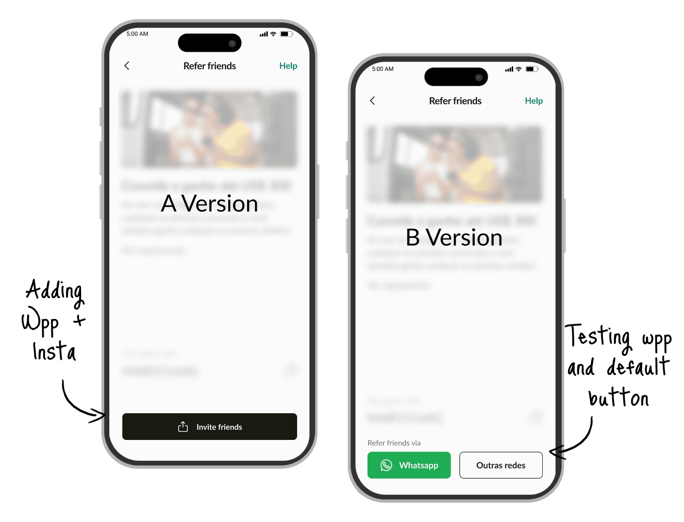
We had a hypothesis that social buttons would increase invitations, because it simplifies the sharing mechanics.

We tested WhatsApp first, since almost every Brazilian uses it daily, and it was a clear win, with 17% higher click rate than the previous one. We later tried Instagram, but results were flat, so we dropped it.
  1. New entry points

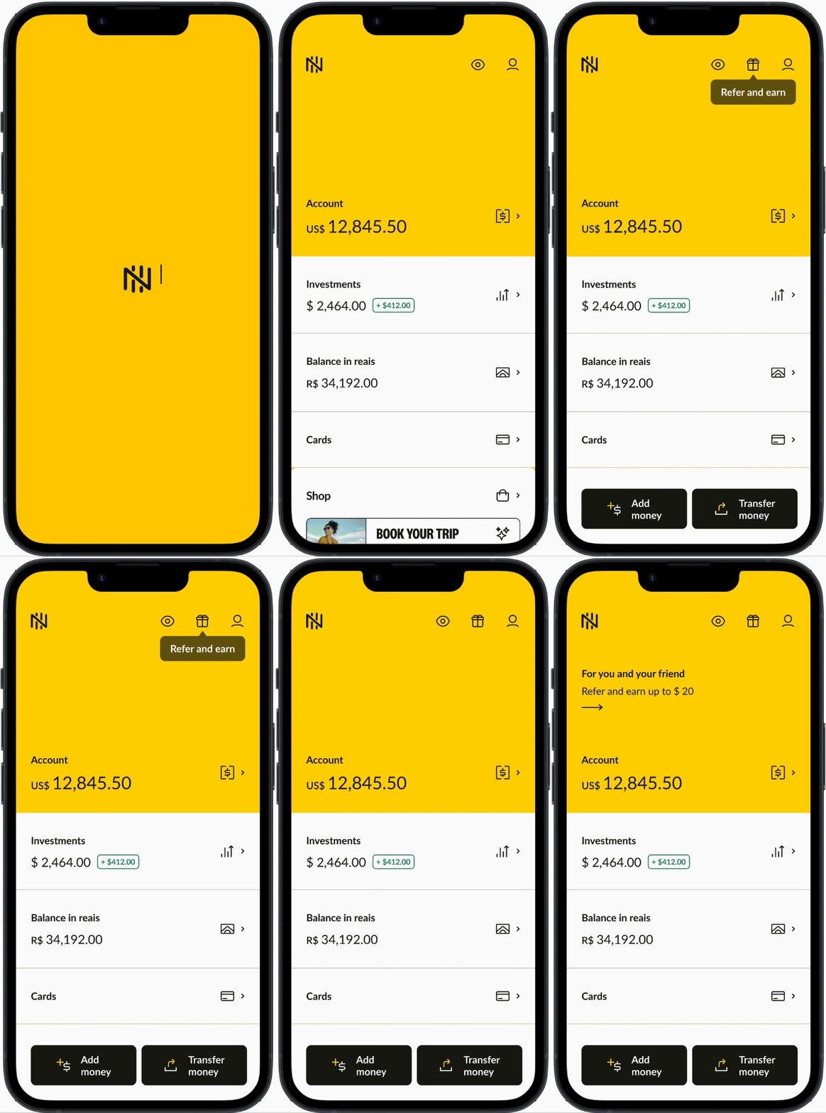
The profile entry point was easy to miss. But moving the program to the home screen meant competing for space with other high-priority features, and stakeholders were concerned it would clutter the app's most valuable real estate.

We made the case using the visibility data we already had, then proposed two lightweight options to get buy-in: a fixed icon on the top edge, and a variable message displayed above the account balances.

We got the green light to test both, and together they quadrupled the program access.
  1. Many others more

The goal was to keep scaling the program, and we tested every possibility we could. All of it, compounded, resulted in numbers we didn't imagine at the beginning. That showed us that experiments are the best tool for Product Growth.

20% higher invitee sign-up rate after segmenting the invite message based on the app main features.

4% increase in referrals after nudging users to invite friends after a successful deposit.

5% increase in the referral rate after facelifting the program highlighting key benefits.

OUTCOMES

+17% on clicks

by changing the main button

3x the referral rate

in over 8 months of testing

+20% sign-up rate

for invitee users

Considerações finais

Considerações finais

The strongest results happened on small experiments, specially the ones that increased visibility and reduced friction. That's why thinking on user experience is super important for growth.


But testing continuously also meant accepting that not every experiment would be a win. Thinking about that, I wouldn't spend so much time in small projects and would try to deliver then faster to test first, and refine later, only if it worked. For this, I would have to create a team agreement that we would need to polish the final version to avoid UX & Design debt.

New Design System component, created first for the Referral program and expanded for other in-app offers.

Second iteration of the Social buttons

Discarded visual exploration for the deposit nudge

Available to work

Let’s create something great together

Let’s create something great together

Let's connect

Maria Gomes © 2026

Create a free website with Framer, the website builder loved by startups, designers and agencies.