SaaS

B2B

Design System

Making Proesc's products easier to build and use with a Design System

Making Proesc's products easier to build and use with a Design System

Making Proesc's products easier to build and use with a Design System

Proesc, School ERP System

Recorded screen of Proesc's Design System in Figma

MY ROLE

Product Designer

TIMELINE

April 2023 -> July 2024

TEAM COMPOSITION

1 Product Designer, 3 Product Owners, Development squad

ABOUT

Proesc is an ERP company that offers a management system for schools. Until 2023, the product had never had a dedicated design effort, and the team realized it was time to change that.

As the first Product Designer at the company, I collaborated closely with Product Owners and Developers to improve usability across the platform and to stablish a design system that would make every new feature easy to build.

SUMMARY

Proesc's products worked, but they were inconsistent, nothing scaled, and school staff regularly got lost in the complexity.

Over 15 months, I built the company's first Design System from the ground up: more than 250 components, 37 variables, and 14 styles, all grounded in real usability and accessibility research rather than visual polish alone.

By the time I left, Proesc kept increasing its design team, who now uses and extends what I'd started, proof the system was built to outlast the person who built it.

Proesc's products worked, but they were inconsistent, nothing scaled, and school staff regularly got lost in the complexity.

Over 15 months, I built the company's first Design System from the ground up: more than 250 components, 37 variables, and 14 styles, all grounded in real usability and accessibility research rather than visual polish alone.

By the time I left, Proesc kept increasing its design team, who now uses and extends what I'd started, proof the system was built to outlast the person who built it.

CONTEXT

Until 2023, Proesc relied on outdated code and delivered a poor user experience across its ERP. After analyzing the product, we began redesigning components and full journeys to improve usability and give the brand a more consistent visual identity.

Until 2023, Proesc relied on outdated code and delivered a poor user experience across its ERP. After analyzing the product, we began redesigning components and full journeys to improve usability and give the brand a more consistent visual identity.

THE PROBLEM

School directors and teachers found the system difficult to navigate, often getting lost in its complexity.

School directors and teachers found the system difficult to navigate, often getting lost in its complexity.

There were plenty accessibility and usability issues across the existing pages, every screen has a table, independent of the user goals or task.

There were plenty accessibility and usability issues across the existing pages, every screen has a table, independent of the user goals or task.

THE GOAL

Give Proesc a scalable design foundation that could support every device and product line, while making the system itself usable enough for teachers and school directors to navigate without friction.

Give Proesc a scalable design foundation that could support every device and product line, while making the system itself usable enough for teachers and school directors to navigate without friction.

The Checkbox component documentation

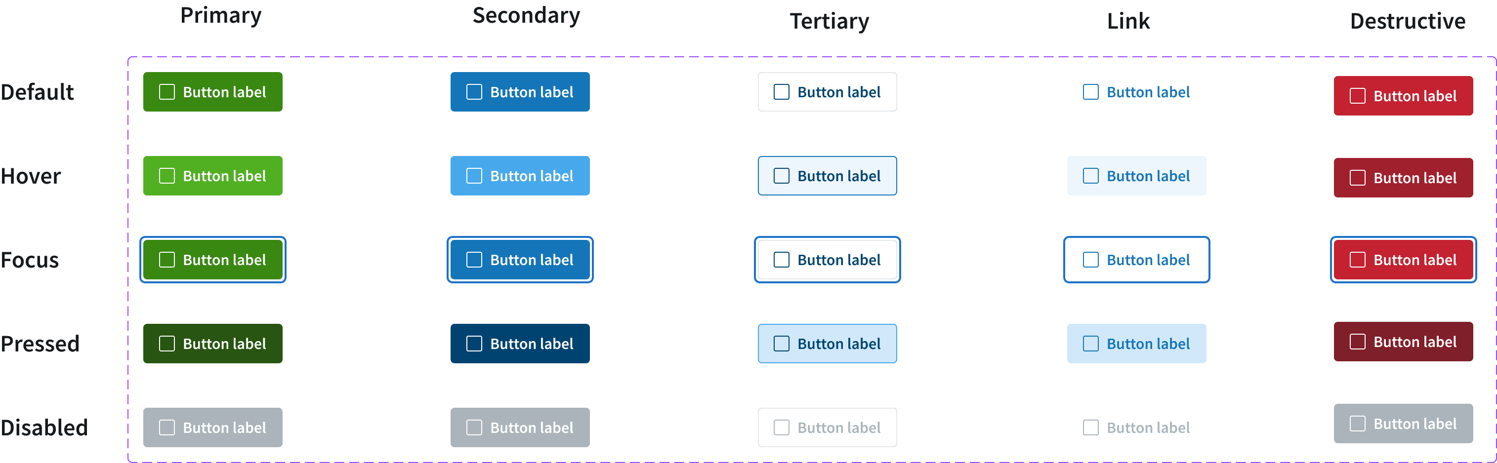
Buttons component
WHAT I DID

Ran a heuristic analysis and mapped the product's core components.

Ran a heuristic analysis and mapped the product's core components.

Before touching any components, I audited the existing journeys to understand where users actually struggled, rather than assuming what needed fixing. From there, I identified which elements repeated across the platform, like buttons, tables, navigation patterns, as the foundation for what the Design System needed to standardize first

Defined the style guide and visual foundations.

Defined the style guide and visual foundations.

Proesc already had a well-defined brand, but the product itself needed new usability and accessibility standards. I created a new color palette, typography, and other visual foundations, like shadows, border radius, built specifically for the product layer, not just the brand.

Built the system in Figma, then handed it to engineering for development.

Built the system in Figma, then handed it to engineering for development.

The Design System was structured using Variants and Components to keep consistency and visual quality intact as it scaled, designed with basic accessibility standards from the beginning. Development then built the components in code, with a visual review step to catch any differences between design and implementation.

Applied the system across the product, not just in Figma.

Applied the system across the product, not just in Figma.

I redesigned several existing pages using the new components, designed new pages that didn't exist yet, and built a new app from scratch, all grounded in the same visual and structural foundations, so the system proved itself in real product surfaces rather than staying a reference file.

OUTCOMES

250+ components created

Including variants, variables, and styles

Higher user satisfaction

reported after the new design was implemented

In retrospect

In retrospect

Building a Design System from scratch as a freelancer was a real challenge. After the core components, the right move I took was building the rest on demand: as features arrived, I built not only them, but the components that held them together and allowed them to scale fast, rather than trying to anticipate everything upfront.


But the bigger lesson happened after they hired a junior designer. By then, I realized I needed to establish more processes and ways for the team to scale. Apart from the Design System documentation, I also built file templates that worked independently of the squad or designer using them, and documented design patterns for mobile and desktop that allowed the system to grow with consistency

Building a Design System from scratch as a freelancer was a real challenge. After the core components, the right move I took was building the rest on demand: as features arrived, I built not only them, but the components that held them together and allowed them to scale fast, rather than trying to anticipate everything upfront.


But the bigger lesson happened after they hired a junior designer. By then, I realized I needed to establish more processes and ways for the team to scale. Apart from the Design System documentation, I also built file templates that worked independently of the squad or designer using them, and documented design patterns for mobile and desktop that allowed the system to grow with consistency

File template structure

New app built from scratch using the new system

Available to work

Let’s create something great together

Let’s create something great together

Let's connect

Maria Gomes © 2026

Create a free website with Framer, the website builder loved by startups, designers and agencies.